Falconnier Design System
Falconnier Design System
A flexible solution for multiple products
🔍 About the Project: the need for a new design system arose from the necessity to create a consistent, scalable, and intuitive user experience across the newest NOVA app by Headway. It was required to streamline the design process to create a new product efficiently under resource optimization conditions.
As the main company product (a broker platform) evolved, existing components and design practices became insufficient for the growing complexity and demands. It was essential to enhance collaboration, and ensure a cohesive UI design process that meets the expectations of developers and users.
🎯 Goal: to design a comprehensive design system, ensuring consistency and scalability across all interfaces of the Headway broker platform and the new NOVA product. The system needed to be flexible enough to support the potential addition of a third product.
🕵️♀️ My Role: Design System Lead and Architect.
📝 My Responsibilities: upgrade or rebuild current UI components into a flexible design system solution. Collaborate with engineers and PMs for seamless integration.
Case contents
Case contents
More case studies about NOVA:
1/3 Tokens
1/3 Tokens
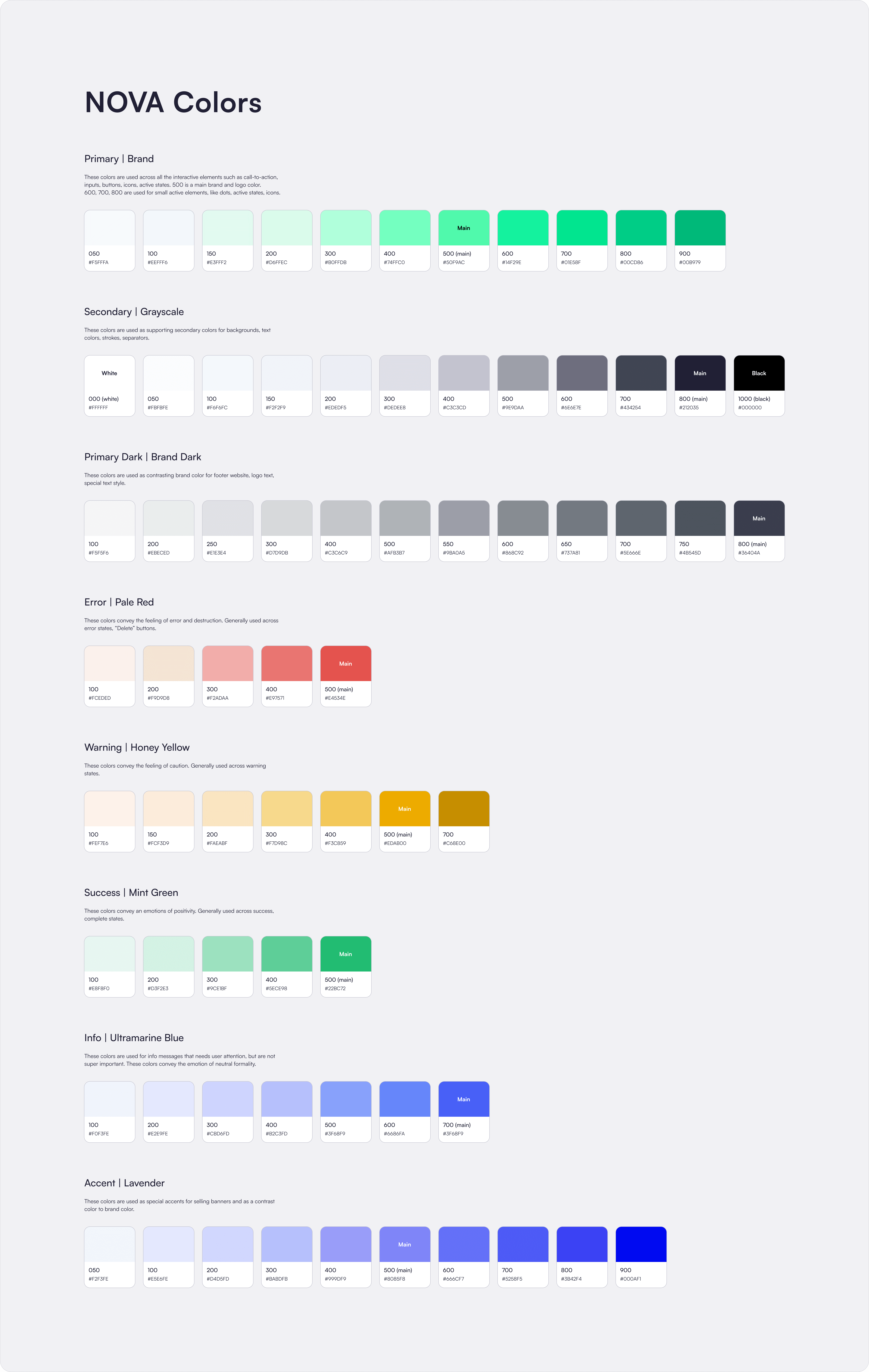
Colors: Variables within Variables
I created complete color libraries for NOVA and Headway products, raising the question: how to use them both in one design system without manually setting colors for all UI elements in each product?
I created complete color libraries for NOVA and Headway products, raising the question: how to use them both in one design system without manually setting colors for all UI elements in each product?

Two color libraries to use at once
To enable the design system to be used across several products, I introduced Figma's newest beta feature at that day - variable modes. After initial testing of using variables within variables, I got it working correctly. I applied this new tool to our project to see how well it could help us create a flexible system, not tied to classic token constants.
As a result, I included modes for all variable color tokens, such as texts, fills, strokes, and backgrounds for all states of UI elements.

Variables within variables as flexible color tokens
Easy switching between products and UI themes
Easy switching between products and UI themes
The Falconnier design system uses connected libraries of NOVA and Headway color variables and mixes them inside. That's what provides an ability for designer to switch the whole interface screens between different product styles and UI themes.
Same thing can be done with fonts and spacings tokens, making it able to transform interfaces from mobile to desktop view with a couple of clicks.
Switching between different products
Pros of this solution:
made all newly created components instantly ready for use in both products,
saved many monotonous working days for designers,
significantly reduced development time,
maintained the continuity of the company products style,
ensured design consistency.
Pros of this solution:
made all newly created components instantly ready for use in both products,
saved many monotonous working days for designers,
significantly reduced development time,
maintained the continuity of the company products style,
ensured design consistency.
Spacings
A comprehensive spacing system with a 4-pixel scale ensures that UI elements are harmoniously aligned.
In the future, the NOVA product will include web version layouts, allowing the interface to switch between mobile and desktop views with a couple of clicks in Figma. For the current needs for NOVA and Headway, the mobile mode was created.

Typography
The system includes 24 styles based on variables for font family, weight, size, letter spacing, and paragraph spacing. These variables were designed with future needs in mind, allowing for include additional support of mobile and desktop modes.
The system includes 24 styles based on variables for font family, weight, size, letter spacing, and paragraph spacing. These variables were designed with future needs in mind, allowing for include additional support of mobile and desktop modes.

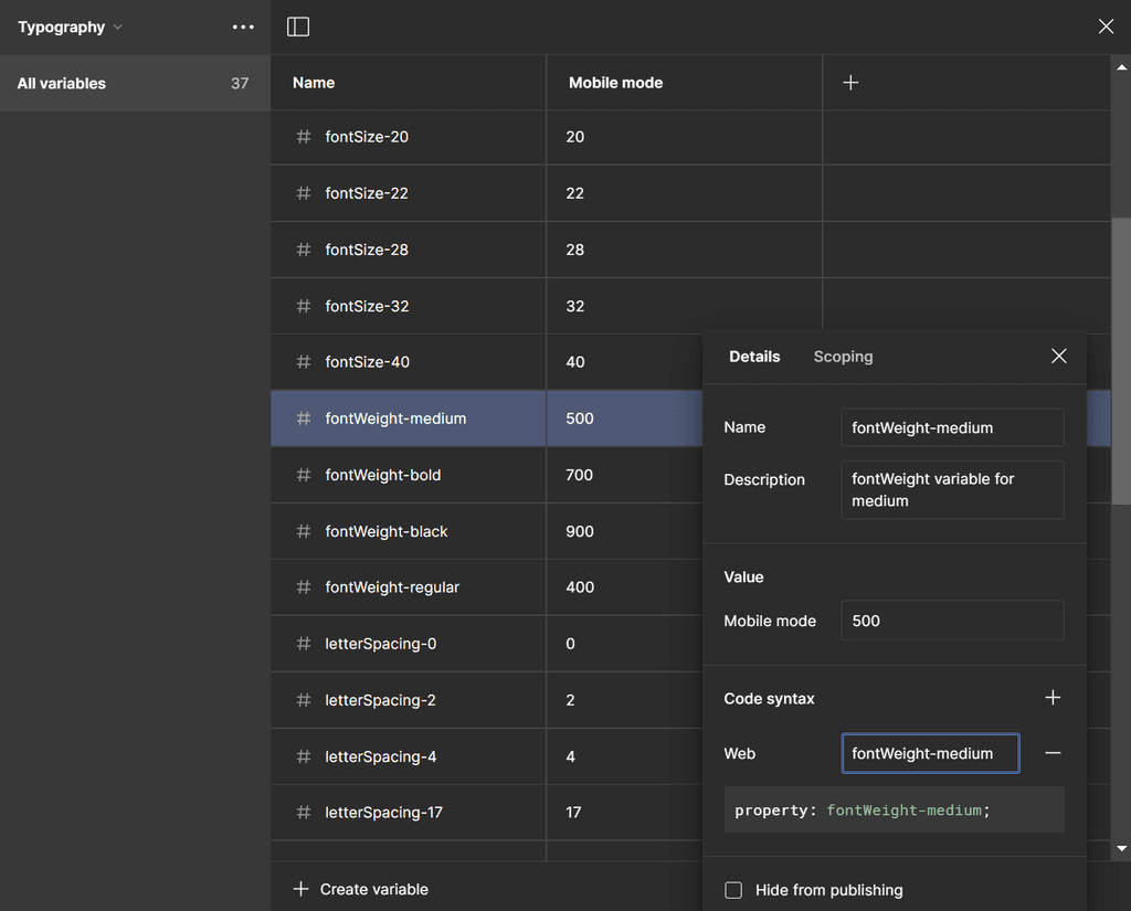
Variables for usage in typography

Text styles structure with variables
Icons library
Initially, the icon library consisted of 885 components, each icons had three styles.
When an icon needed replacement, the designer followed a three-step process: opening the dropdown of icon components, selecting the icon style submenu, using keyword search, finding the appropriate icon, and selecting it.
I streamlined this process by combining each icon into one component with three style variants, reducing the 885 icon components to 295.
Eliminating these extra steps significantly improved the usability and experience of using icons. Designers no longer needed to select the icon style during the search and could immediately use the search to find the desired icon.

-66%
-66%
Icon components number
Icon components number
-3
-3
Clicks in a one design microprocess
Clicks in a one design microprocess
2/3 Components
2/3 Components
Flexible Text Field
Text field element designed to serve as:
A text input with or without action icons. Icons can be selected from the library through linked instances.
A resizable multiline text area.
A dropdown.
Text field element designed to serve as:
A text input with or without action icons. Icons can be selected from the library through linked instances.
A resizable multiline text area.
A dropdown.
To quickly assemble the draft registration flow for a new project, I systematized the essential elements, starting with text fields and buttons. The first version of the text field component had 50 variants.
To quickly assemble the draft registration flow for a new project, I systematized the essential elements, starting with text fields and buttons. The first version of the text field component had 50 variants.

v1.3 of the Text Field component
In the second version, I optimized it to include just 4 variants, but highly customizable:
In the second version, I optimized it to include just 4 variants, but highly customizable:

v2.0: just 4 variants, but highly customizable
-92%
-92%
Variants number
for Text Field component
Variants number
for Text Field component
Buttons
After collecting all versions of buttons used in previous system, the first version of button component contained 256 variants. At first step I balanced L and R paddings inside the buttons with icons. Main properties are:
3 sizes: large (L), medium (M), small (S)
4 types: primary, secondary, tertiary, ghost
6 states: default, hover, pressed, loading, disabled, focused
(optional) icons with icon instances.
(optional) text

v1.0: 256 variants collected through all the interfaces
Later In the second version it was also optimized to 132 variants:
Later In the second version it was also optimized to 132 variants:

v2.0: reduced number of variants from 256 to 132
-48%
-48%
Variants number
for Button component
Variants number
for Button component

Other UI library elements


3/3 Results and conclusions
3/3 Results and conclusions
Improving team experience
The newly established Falconnier Design System provided a robust framework for Headway company. It facilitated efficient collaboration across the team and significantly enhanced the collaboration between devs and our design team.
Falconnier design system helped:
Developers better understand final design decisions, resulting in fewer questions during development.
UX/UI designers focus more on UX quality rather than small visual issues and layout alignment.
Stakeholders have more realistic expectations during presentations and a clearer understanding of the final outcome.
QA and front-end engineers liked the design system and mockup clarity a lot, stating that it almost replaced textual documentation.
New design system updates were approved by the team, documented, and handed over to development.
We streamlined the processes and ensured consistency and efficiency across products UI quality, setting a new standard for design within the company.

🚀 Impact on company's design processes
Previously, the design process involved creating a black-and-white prototype for approval, then restyling it into the final UI. Designers built the same interfaces twice: first as sketches with temporary elements, then with final UI elements.
This led to a new company-wide design process, reducing layout assembly time by 30% compared to the old approach. The design system reduced the evolution time of layouts from prototypes to final UI screens by about 25% compared to the old process. The number of styles and components was optimized severely.
-25%
-25%
Prototypes to final UI design processing time
Prototypes to final UI design processing time
76%
76%
Tokens converted from static styles to variables
Tokens converted from static styles to variables
-30%
-30%
Layout assembly time
Layout assembly time
-83%
-83%
Component number
Component number
🏁 Work summary
Component consolidation: standardized existing UI components from various products within the company.
Design system organization: differentiated between core design system elements and miscellaneous UI components used situationally in mockups.
Auto-layout implementation: introduced auto-layouts to enhance flexibility and responsiveness.
Resizing support: enhanced components to support extensive resizing, making the app adaptable to various screen sizes and devices.
Padding and spacing standardization: ensured consistent padding and spacing across all UI elements.
Component optimization: refined component properties, reducing the number of variants for more efficient design and development.
Token libraries creation: established token libraries for consistent styling and theming.
Static to Variable tokens conversion: converted static design tokens into variables for better scalability and maintainability.